
A Simple Map Post Sparked Internet Confusion About Traveling In A Straight Line Across Earth
Sometimes the most powerful reminders about how little we understand the world don’t come from complicated scientific discoveries. They come from something much simpler, like a map.
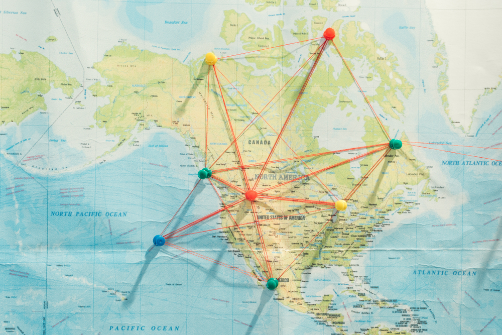
Recently, a seemingly ordinary post circulating on social media sparked widespread confusion online. The post showed a straight path between the United States and India, suggesting that you could travel between the two countries in a straight line across the globe. For many people, that claim felt wrong. Some insisted it couldn’t possibly be true. Others argued that the line must be curved or misleading.
But the confusion revealed something deeper than a disagreement about geography. It exposed how the way we visualize the world can shape what we believe about it. And sometimes, the map we’ve trusted our entire lives is quietly teaching us the wrong lesson.
The viral moment took off when a social media account called Latest in Space shared a map suggesting that you could travel from India to the USA in a straight line. The internet quickly filled with disbelief.
Why would something so simple spark such confusion? To answer that, we have to zoom out and look at the bigger picture, not just of our planet, but of how we represent it.
Fun fact: Without touching a single piece of land, it's possible to sail from India to the USA in a completely straight line pic.twitter.com/Teu6edDox6
— Latest in space (@latestinspace) May 30, 2024
When Our Maps Trick Our Minds
Most people do not interact with the Earth directly as a sphere. Instead, we learn the planet through diagrams, atlases, classroom posters, and digital maps. Over time those visual references become mental shortcuts. They shape how we imagine distance, direction, and global relationships. Cognitive scientists note that humans rely heavily on visual models to organize complex spatial information, which is why the maps we grow up seeing can strongly influence how we interpret geography. Research on cognitive maps suggests that repeated exposure to world maps can influence how people perceive global scale and area relationships. The study found that people who grow up regularly viewing distorted projections can internalize those distortions in their mental image of the world, leading them to misjudge the relative size and position of continents.

Representing a three dimensional world on a flat two dimensional map always involves compromises. No matter how carefully cartographers design a map, something has to give.
No matter how accurate a map tries to be, some areas become stretched, some countries appear compressed, or parts of the world have to be omitted.
These compromises rarely stand out during everyday use because maps are designed to feel intuitive. They prioritize clarity and usability rather than perfect physical accuracy. The challenge is that when a simplified visual system becomes familiar, the brain begins to treat it as reality rather than interpretation. That is why a route that seems counterintuitive on a flat map can trigger confusion online. The mental image people carry of the world is not wrong, but it is incomplete, and moments like this reveal the gap between representation and the physical shape of the planet.
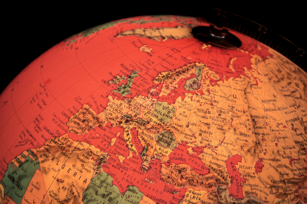
The Mercator Projection: A Map That Changed the World
Most modern world maps trace their lineage to a projection introduced in 1569 by Flemish cartographer Gerardus Mercator. His goal was not to create a perfectly realistic picture of Earth, but to solve a practical problem faced by sailors navigating vast oceans. During the Age of Exploration, mariners needed a map that allowed them to follow a consistent compass direction across long distances. Mercator designed a projection that preserved directional angles, allowing navigators to plot routes using straight compass bearings. This innovation transformed navigation and helped make global sea travel more reliable.
To achieve this, Mercator mathematically projected the surface of the globe onto a cylinder that could then be unrolled into a rectangular map. In this representation, lines of longitude appear as vertical lines and lines of latitude appear as horizontal lines that intersect at right angles. This structure made it possible for navigators to draw a route with a constant compass heading directly on the map and follow that same bearing in the real world. For centuries before satellite navigation existed, this property made the Mercator projection one of the most useful tools for maritime navigation.
Because the projection preserved direction so effectively, it became widely adopted in atlases, textbooks, and navigation charts. Its practicality ensured its influence far beyond its original maritime purpose, shaping how generations of people came to visualize the layout of the planet. Even today, many digital mapping systems still use variants of the Mercator projection because its grid structure works efficiently for navigation and interactive mapping systems.
The Distortion Problem We Rarely Notice
Even when people understand that maps simplify reality, the consequences of those simplifications are rarely obvious. One of the most studied effects of world map projections is how they alter perceived scale. Regions that appear larger on a commonly used projection can seem more dominant or geographically significant than they truly are. This effect is not just visual. Studies in cartography and geographic education show that map projections can shape how people estimate the relative size of continents and countries when asked to compare them from memory.
The visual pattern behind this distortion is systematic. Areas closer to the equator tend to retain proportions that appear more realistic, while regions farther from the equator gradually expand on the map. Over time this stretching can make northern regions appear disproportionately large compared with land closer to the equator. A well known example often used in geography education compares Greenland and Africa. On many common maps Greenland appears comparable in size, yet Africa is in reality vastly larger. This difference highlights how projection distortion can quietly reshape intuitive judgments about geographic scale.
Because these distortions are consistent across many widely used maps, people often absorb them without noticing. Classroom maps, textbooks, and online mapping interfaces repeat the same visual relationships again and again. Over years of exposure those relationships can become part of a person’s internal picture of the planet. The result is not misinformation in a deliberate sense, but a subtle shift in perception where the visual logic of the map begins to stand in for the physical proportions of the Earth itself.
Why a Straight Line on Earth Looks Curved on a Map
The confusion begins with a basic geometric mismatch. A route on Earth is traced across a curved surface, but most people encounter that route on a flat rectangular image. On a globe, the shortest path between two distant points follows the natural curvature of the sphere. In navigation and aviation, that path is called a great circle route. It is not straight in the same visual sense that a ruler line is straight on paper, yet it is the most direct path available across the surface of a round planet.
Once that same path is transferred onto a flat map, its appearance changes. The projection has to translate a curved surface into a two dimensional image, and in doing so it alters how routes are drawn. A path that is direct on the globe can appear to bend upward, dip downward, or arc across the page even though the traveler is not making those dramatic turns in physical space. What looks curved on the map is often just the flat image struggling to represent a route that makes sense only on a sphere.

This is why the route between the United States and India can seem visually counterintuitive when seen online. People expect a straight trip to resemble a straight line on the screen, but that expectation comes from paper geometry rather than planetary geometry. In practice, the traveler follows a continuous path shaped by the Earth itself. The apparent curve is not evidence that the route is wrong. It is evidence that a flat map cannot fully preserve the logic of motion across a round world.
What This Viral Moment Can Teach Us
If a simple map can spark global confusion, it also offers an opportunity for reflection. Moments like this reveal how quickly assumptions can form when people rely on familiar visual cues. What appeared obvious to many viewers of the map was based on an expectation shaped by the way maps are commonly displayed. When that expectation was challenged, the reaction exposed how easily confidence can grow around an incomplete understanding of how the world is represented.
1. The World Is More Complex Than It Appears
Maps, charts, and social media images simplify complex systems so people can grasp them quickly. That usefulness comes with a tradeoff. Simplification removes detail, scale, and context. A representation can guide understanding, but it cannot fully reproduce the reality it describes. Treating these tools as approximations rather than exact reflections encourages more careful interpretation.

2. Curiosity Matters More Than Certainty
Much of the online debate around the map came from quick certainty rather than investigation. When new information conflicts with a familiar belief, people often defend the belief instead of examining the evidence. Scientific thinking moves in the opposite direction. Progress comes from questioning assumptions, testing explanations, and remaining open to revision. Curiosity keeps understanding flexible.
3. Perspective Changes Everything
Clarity often depends on the frame through which a problem is viewed. An idea that seems incorrect in one frame can become obvious in another. In this case, the difference between a spherical surface and a flat image resolves the apparent contradiction. More broadly, many disagreements arise because people analyze the same situation through different conceptual frames. Shifting that frame can turn confusion into understanding.
A Deeper Lesson About Perspective
The discussion sparked by the map highlights a broader pattern in how people understand the world. Humans rarely interact with complex systems directly. Instead, we rely on simplified models that help us interpret reality. These models might be maps, graphs, headlines, or statistics. They allow the brain to process large amounts of information quickly, but they are not perfect reflections of the things they represent. Psychologists describe these simplified internal representations as mental models, frameworks the mind uses to organize knowledge and guide decisions. Once a model becomes familiar, people tend to rely on it automatically, even when new information suggests the model may be incomplete.

This tendency explains why moments like the viral map debate feel surprising. When information contradicts the model people already carry in their minds, the first reaction is often skepticism because familiar frameworks reduce mental effort and create a sense of certainty. Yet learning often begins when those frameworks are questioned. Progress rarely comes from abandoning models entirely but from refining them when they no longer explain what we observe. The willingness to reconsider assumptions and adjust perspective allows understanding to deepen, and moments of confusion can become the starting point for clearer insight.
Featured Image from Shutterstock