Does Coca-Cola’s Logo Hide a Smile, or Do We Just See What We Want To?
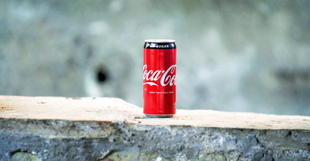
Logos are more than just pretty pictures. They are silent storytellers, shaping how we feel about the brands that surround us every single day. Think about Coca-Cola. Its red-and-white script has been stitched into global culture for over a century. You see it on billboards, at holiday parades, in the hands of friends on a summer afternoon. But hidden in plain sight, experts say, is a subtle design choice that many people overlook: the second “C” in Coca-Cola curves into the shape of a smile.

However, that tiny flourish isn’t just about aesthetics. Could it be that even without realizing it, millions of people associate Coke not only with a drink but with joy itself? In this piece, we’ll explore that fascinating claim, consider the skeptics, and journey into the world of hidden messages in logos, where simple lines and shapes can carry meanings powerful enough to shape culture.
The Subconscious Power of Coca-Cola’s Smile
When you look at a logo, you may think you are just seeing colors and shapes. But the truth is, design can reach far deeper. It can speak to the subconscious, shaping how we feel without us ever realizing it. Richard Lau, president of LOGO.com, reminds us that a logo is not just decoration, but a bridge. In his words: “Businesses cannot overlook the value a great logo holds; they are the connection between a company and potential customers, and what customers will remember most.”
Take Coca-Cola. Lau points out that if you pay attention to the second “C” in its script, you will notice it extends into the shape of a smile. To most of us, this detail slips by unnoticed, but as Lau explains, it “subconsciously reflects Coca-Cola’s emphasis on happiness and joy.” He adds: “This subtle message may go unnoticed, but it subconsciously creates a positive association with the brand in the minds of consumers.”

For over a century, Coca-Cola has sold more than just a beverage. It has sold the feeling of joy. From its “Open Happiness” campaign to the holiday ads featuring Santa Claus, the brand has always leaned into emotional storytelling. The suggestion of a smile embedded in its logo fits seamlessly into this legacy, working quietly where slogans and commercials shout. Reader’s Digest echoes this interpretation, noting that “many people believe the ribbon-like extension on the first ‘C’ acts as a smiling flourish,” reinforcing the company’s reputation as a bringer of cheer.
Still, it is worth noting that Coca-Cola itself has never officially confirmed this smile. Whether intentional or coincidental, the design has become a mirror for what people already associate with the brand: positivity, longevity, and emotional resonance. Sometimes, meaning is not only about what a designer intended. It is about what people choose to see, and the feelings that recognition awakens.
When Imagination Shapes What History Does Not Confirm
Not everyone is convinced that Coca-Cola’s logo hides a smile. While the idea captures imagination, there is little in the company’s official records to back it up. As Creative Bloq points out, “since Coca-Cola’s own history of its logo through the years contains no mention of a smile … it’s looking unlikely to be a conscious design choice.” The archives carefully document changes in typography and refinements to the script across more than a century, yet there is no reference to a hidden face or expression within the design. This absence of acknowledgment leads skeptics to argue that what people interpret as a smile may simply be a coincidence of artistic lettering.

The argument gains further strength when looking at Coca-Cola’s 2013 “Open Happiness” campaign. In that moment, designers purposefully altered the curvature of the “C” to resemble a grin more clearly. But as Creative Bloq notes, “that version had to be edited manually, suggesting it wasn’t inherent to the original design.” In other words, if the smile had been there all along, there would have been no need to artificially enhance it for the campaign.
From this perspective, the so-called smile becomes less a secret embedded by designers and more a reflection of what people want to see. Observers often project meaning onto symbols, and iconic logos are especially prone to these interpretations. Without definitive confirmation from Coca-Cola, the smile remains speculative. For critics, it is imagined rather than real, a cultural narrative born out of perception rather than intent.
How Coca-Cola Wove Design Into Culture and Memory
Coca-Cola’s influence has never been limited to its logo. What makes its identity so enduring is the way the company has consistently tied its visual design to broader cultural stories. According to the company’s official history, “the famous Coca-Cola contour bottle was introduced in 1915, and the first advertising featuring Santa Claus carrying a Coke appeared in 1931.” These choices connected the brand not only to a product but to experiences that live in people’s memories, from the feel of a uniquely shaped bottle in their hands to the warmth of holiday celebrations.
The introduction of the contour bottle proved to be a milestone in product design. Coca-Cola’s archives emphasize that it was so recognizable that customers could identify it “even in the dark or when broken.” This innovation meant that the drink was not simply known for its flavor but also for a tactile experience that reinforced brand recognition in ways few competitors could replicate.

The decision to link Coca-Cola with Santa Claus carried a similar cultural weight. Through advertisements that showed Santa in a red suit with a joyful expression, the brand placed itself at the heart of holiday tradition. Advertising historian Mark Pendergrast has explained that these campaigns “helped define the modern image of Santa Claus” while also strengthening Coca-Cola’s association with joy, celebration, and togetherness.
By weaving its imagery into cultural moments like these, Coca-Cola built what scholars describe as “one of the most enduring identities in modern marketing.” Its logo alone was never responsible for this longevity. Instead, it was the interplay between design, packaging, and storytelling that allowed the brand to remain relevant across generations.
When Logos Whisper Stories Hidden in Plain Sight
When we glance at a logo, we may assume it is simply a mark of recognition. Yet some of the most iconic designs contain hidden elements that speak to values, history, or promises that the brand wants us to remember. These details are carefully crafted choices that add depth to what we see. Here are several notable examples:

- FedEx: Designer Lindon Leader noticed that the negative space between the “E” and the “x” could form an arrow. He explained, “If I could develop this concept of an arrow, it could be promoted as a symbol for speed and precision, both FedEx communicative attributes.” He also added, “The power of the hidden arrow is simply that it is a ‘hidden bonus.’ Either you see it or you don’t.” This subtle arrow reinforces the company’s reputation for reliability and efficiency.
- Amazon: The agency Turner Duckworth described how the logo was built, writing, “We created an icon that encapsulated everything from A-Z,” and explained that they “took their existing frown and turned it upside down.” The arrow connecting A to Z also forms a smile, showing both the breadth of Amazon’s products and its focus on customer satisfaction.
- Pinterest: The letter “P” in the logo doubles as a pushpin, a direct nod to the platform’s function as a virtual pinboard. This simple detail visually captures the essence of the service.
- Hyundai: While many see only an italic “H,” branding experts have pointed out that it also depicts two people shaking hands. The handshake represents trust and the relationship between the company and its customers.

- Toyota: The three overlapping ovals in the Toyota logo are not random decoration. According to the company, they symbolize the union of customer and product while also containing every letter of the word Toyota within the design.
Each of these examples shows that logos often carry layers of meaning that go beyond simple recognition. They invite people to look more closely and, once discovered, create a deeper connection with the brand’s story.
What We Choose to See
In the end, whether Coca-Cola’s logo truly holds a smile or not may not be the most important question. The real lesson lies in the way we interpret symbols, and how those interpretations shape our reality. A curve in a letter, a hidden arrow, or a bear inside a mountain—these are reminders that the world is full of meaning waiting for us to notice.
Sometimes what we see in a design is not what the creator intended, but what our own mind chooses to project. And that is powerful. Because just like a logo, our lives are canvases filled with shapes, patterns, and stories that can be seen in different ways. We can look at the same circumstance and see limitation, or we can choose to see opportunity. We can see emptiness, or we can choose to see possibility.
So the next time you glance at a logo, or even at your own reflection, ask yourself: what story am I telling myself right now? What hidden smile might already be there, waiting for me to see it? Because perception is not just about branding. It is about life. And when we train ourselves to notice the joy hidden in plain sight, we begin to carry that same joy into everything we do.
Loading...

